Institution Enterprises-Easy SEO and Site Speed
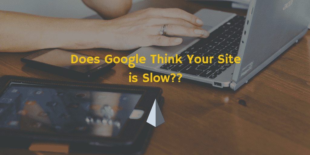
53% of Mobile Visitors Leave a Page That Takes Longer Than 3 Seconds to Load!
Don’t miss out on customers because your website is SLOW!!
The Short Version:
About 57% of online searches are done from a mobile device so you better make sure your website is FAST, not just on the desktop, but when rendered for mobile. Your site load times (site speed) will have a DIRECT impact on your SEO ranking.
We discussed site speed back in our Easy SEO: Step 1-Site Speed article. That article included free tools to measure your site speed, and some easy plugins that will help optimize your site speed. Be sure to read that article to make sure you have the foundation for speed in place.
This article covers the importance of mobile design for your website. Google reports that slow load times lost people’s interest in a major way. With mobile use being so common, it is critical to address the unique challenges of making your website “mobile friendly”.
Desktop vs Mobile
Most of us design a website from a desktop computer. This means that the design is built around how the site looks from a full screen. As mobile online searches has recently surpassed desktop searches, it is imperative to prioritize mobile design. What may look great on your desktop, may be too cluttered or too long when converted to a mobile screen.
Mobile Design Factors
The issue with mobile is that they typically function on a wireless network. Desktops typically operate on a hard line network. Wireless networks can’t transmit data as fast as a wired network. Images and extensive design elements are large files that will generally be slower to load across a wireless network.
Additionally, the design and layout that fits nicely on a 15″ or larger monitor has to be scaled down to fit a mobile screen. This could be a cell phone, with a 5″ screen, or a tablet. Squeezing and shrinking things down to fit a mobile screen requires extra work from the network. This will also slow down load times. Especially if there are a lot of images and design elements.
Mobile Friendly
Your website should feature either “responsive” or “adaptive” design. Responsiveness became a web design standard in the last several years, but if your website is older than about 5 years you need to make sure it is mobile friendly.
Responsive Design
A responsive design is one that automatically changes the website to fit whatever screen it is being viewed from. It maintains design and features, just reorganizes them so they fit on the screen. This means that the viewer will likely have to scroll down through from a mobile device to see content that may be readily seen on a desktop. Responsive designs feature one layout that changes for all sizes of screens.
WANT TO KNOW IF YOUR SITE MEETS GOOGLE’S SPEED REQUIREMENTS?
EMAIL US FOR A FREE REPORT!!
Adaptive Design
Adaptive design features multiple layouts to meet screen size. That means that 1 website would need at least 3 layouts: desktop, mobile, tablet. When someone visits the site, the back end detects the device and loads the appropriate layout. The problem with adaptive is that there are so many different screen sizes out there, there is a chance that your “mobile layout” will not render properly on somebody’s cell phone.
Responsive designs, are in general faster than adaptive. The good news is, if you use a WordPress platform to design your website (the gold standard as far as we are concerned), you won’t need to be (or hire) a master in coding and CSS in order to make your site responsive. There are thousands of beautiful and customizable “themes” (basically, a design template) that will automatically be responsive. Some of them will even allow you to customize certain design elements to be responsive or not…meaning, if there is a huge image or file that is not critical to design, you can choose to remove it from mobile design, making your mobile load time faster.
CONTACT US to Learn More
As always, Institution Enterprises is here to help. Want to talk about this more? Shoot us an email. Want help making sure your website is up to Google’s speed standards? We can provide a site audit for you! Need help refining your messaging on an upcoming campaign? Reach out. Our motto is “with you, not for you”, because we believe the best way to help you is by helping you learn how to do it yourself (like training wheels, we help make sure you do it right).
“We do it with you, not for you”
Institution Enterprises is a Sacramento marketing firm that provides a new standard in business consulting and education, helping your start-up or seasoned business design the practices and customs for success in today’s marketplace.
marketing | social media | SEO | analytics | content | education | Six Sigma